Insight from RAMetrics
The unique, tangible experience of printed news consumption reaches 19 million readers each month. Print also provides advertisers with a range of exciting and memorable formats – from gatefolds to z-shaped ads, scented ink to translucent paper. Within this dynamic landscape, a fundamental question remains: does size matter?
While it may seem inevitable that bigger ads have a bigger impact, here’s the proof. Using RAMetrics we examined the effectiveness of different ad sizes in driving recall, attention/recognition, engagement and action measures.
The great and the good
Looking at RAMetrics data for 2022-2023 we can see that 83% of readers recall double page spreads, 78% recall cover wraps and 77% recall full page ads. In almost every metric you will get significantly better results from a double page spread compared to smaller formats.
- They are easier to understand: 72% found spreads easy to understand, whereas 67% felt the same about a full page.
- Bigger ads are more appealing: 50% of readers found spreads appealing versus 43% for full pages.
- They prompt action: 27% of readers would buy or consider buying if they saw a double page spread, whereas just 18% would for a quarter page ad.
These findings are corroborated by Lumen eye tracking research. Lumen tracks what people are looking at when consuming media, how long they spend on pages and ads’ dwell time.
They have found on average full-page ads are viewed by 92% of people whereas half page ads are viewed by 81%. Average dwell times are also higher: 3.3 seconds versus 2.2 seconds respectively.
Small but mighty
Don’t rule out the smaller formats, however. Within the 130 RAMetrics cases, recall was 69% for half page ads and 73% for quarter pages, showing that the strength of the creative has a major part to play.
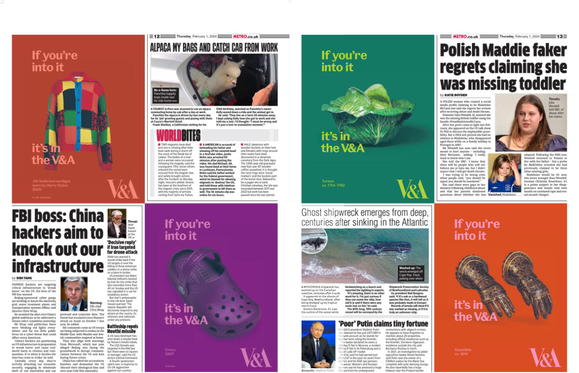
A great idea in a small space can easily outperform a weaker idea in a big space. The RAMetrics “fresh approach” metric gives a measure of creativity. 55% of people identified quarter page ads as having a fresh approach as opposed to 51% for full pages and 54% for double page spreads. Sometimes it’s not about size but what you do with it. The V&A’s recent if you’re into it campaign is a great example of effective creativity in a quarter page.
Previous ad testing by Newsworks has shown that the best way to make the most of smaller spaces is to design the ads to fit the space. This sounds simple, but there are many examples where artwork has been “shrunk to fit” where so much has been crammed in that the ad is confusing, hard to look at or looks like an effort to read.
The RAMetrics results give us confirmation on what we’ve always instinctively known: bigger is better. But, the importance of creativity – in any size – should not be ignored.
More RAMetrics analysis
Does size matter? Is bigger better? We’ve always known, always had a gut-feeling about the answer to this question – but now we have proof.
In an increasingly digital world, the fate of print advertising is often called into question. Does the rise of the internet mean the death of newspaper ads?
This analysis using the latest RAMetrics data will help you decide whether text or images (or both!) is right for your campaign